Enjoy every Sips
Christophe Mathieu shares with us his vision behind the creations of Sips, with the aim of combining accessibility, functionality and aesthetics, all while generating an emotional response in users. Inspired by the Memphis era of the mid-80s, Christophe reflects on the process of giving Sips an adaptable yet recognisable identity, allowing it to have its own personality and speak its own language.
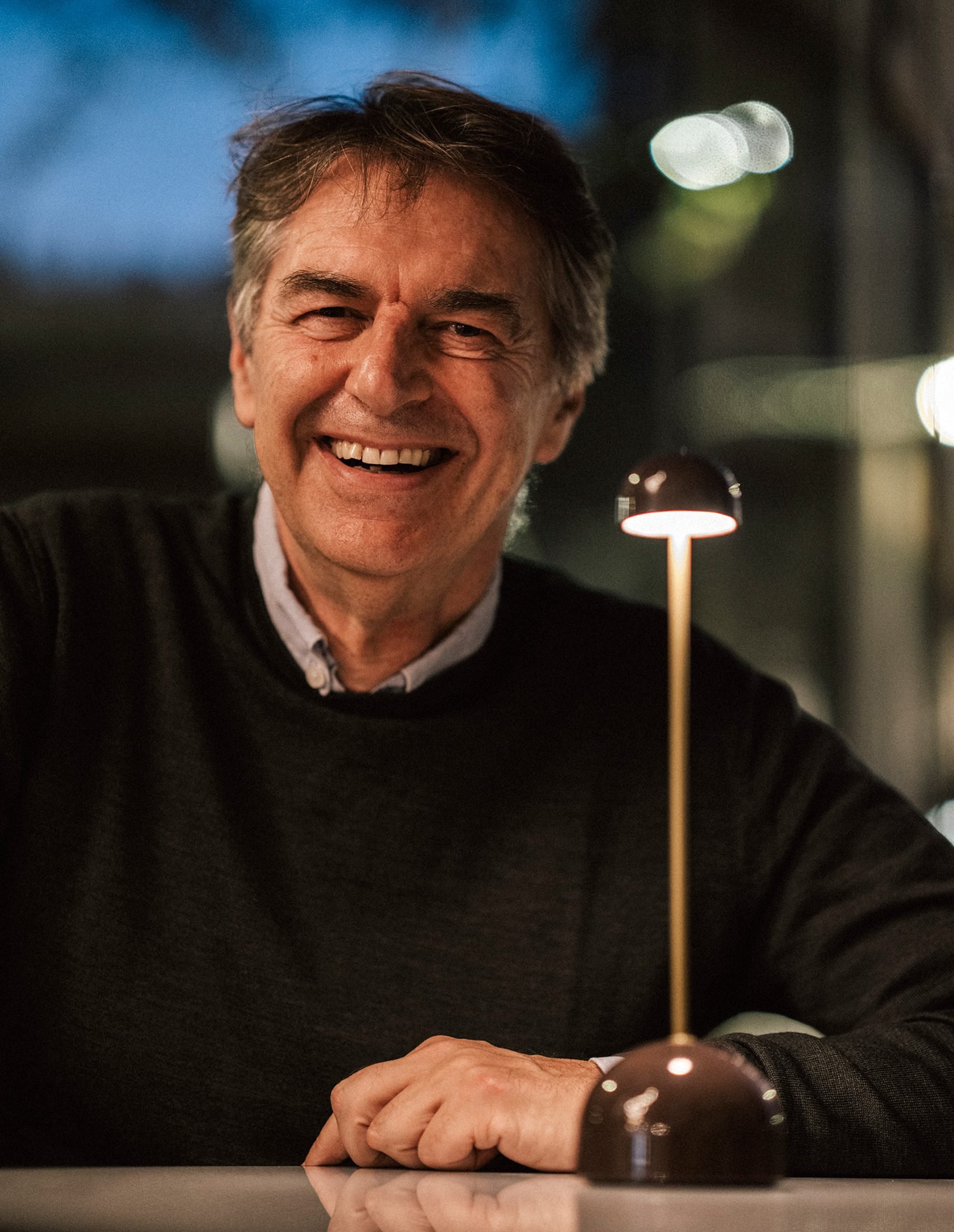
Christophe, as a creative and designer, what is your design philosophy?
My design philosophy is to respond to the needs of the user, creating objects that are accessible and combine functionality and aesthetics, with the aim of being understandable and generating an emotional response in users.
Could you tell us about the inspiration behind your latest lamp design, Sips?
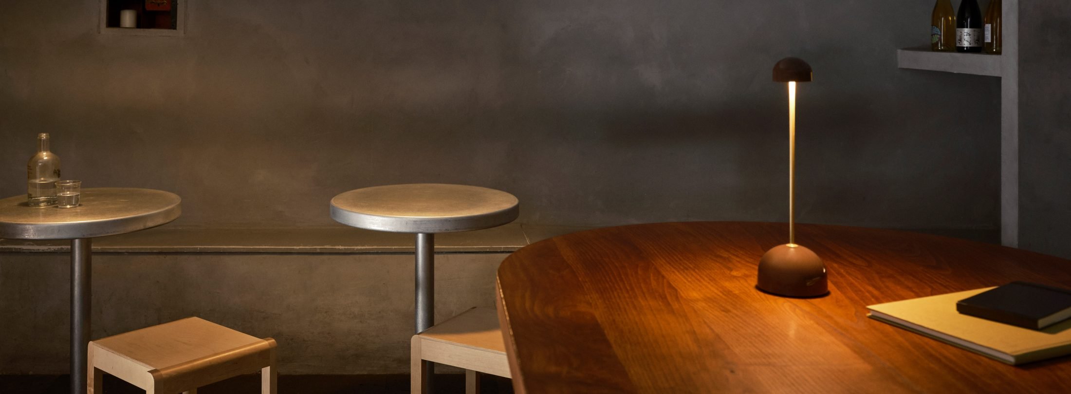
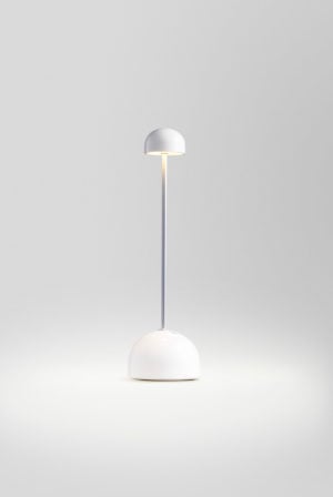
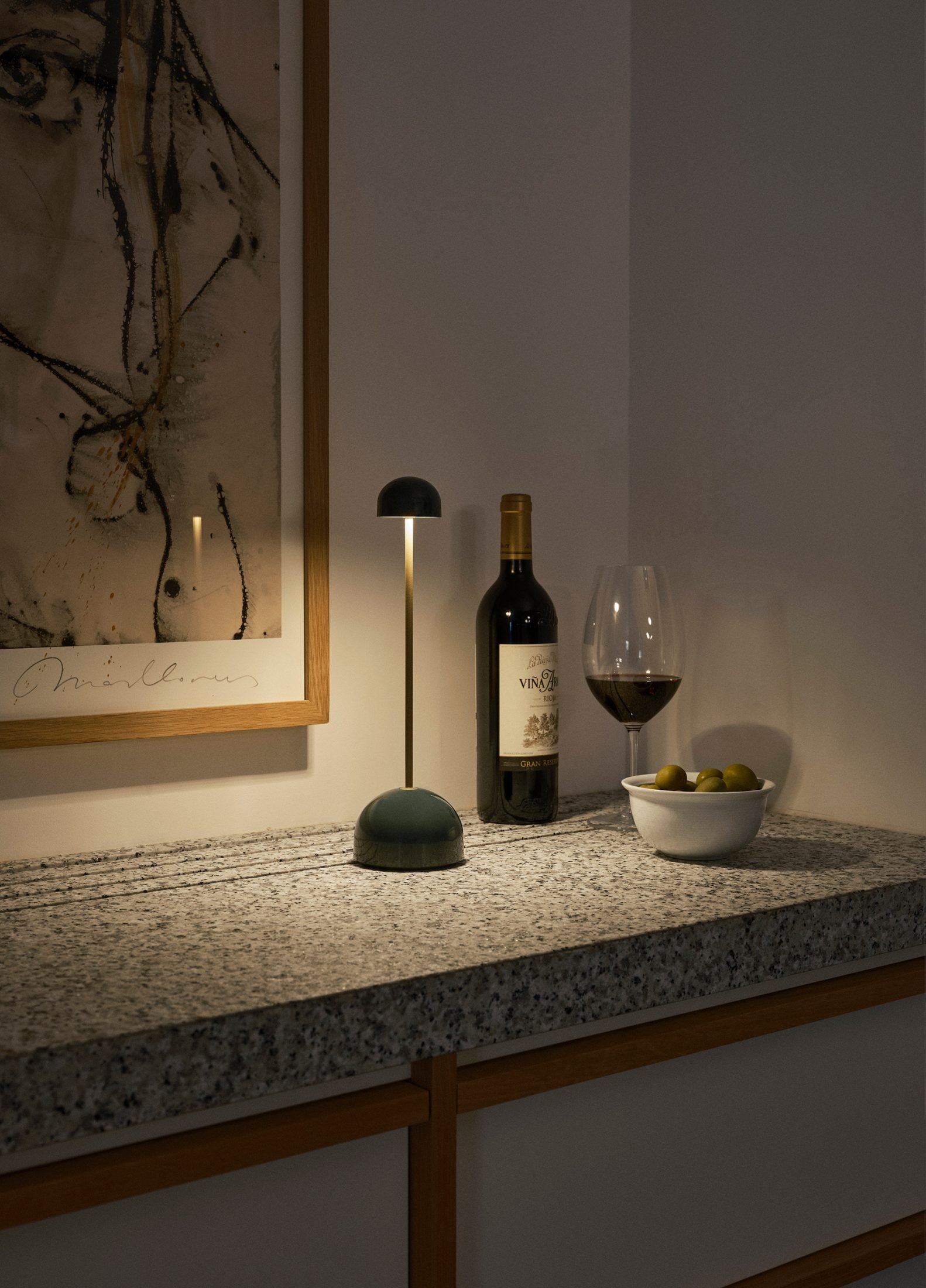
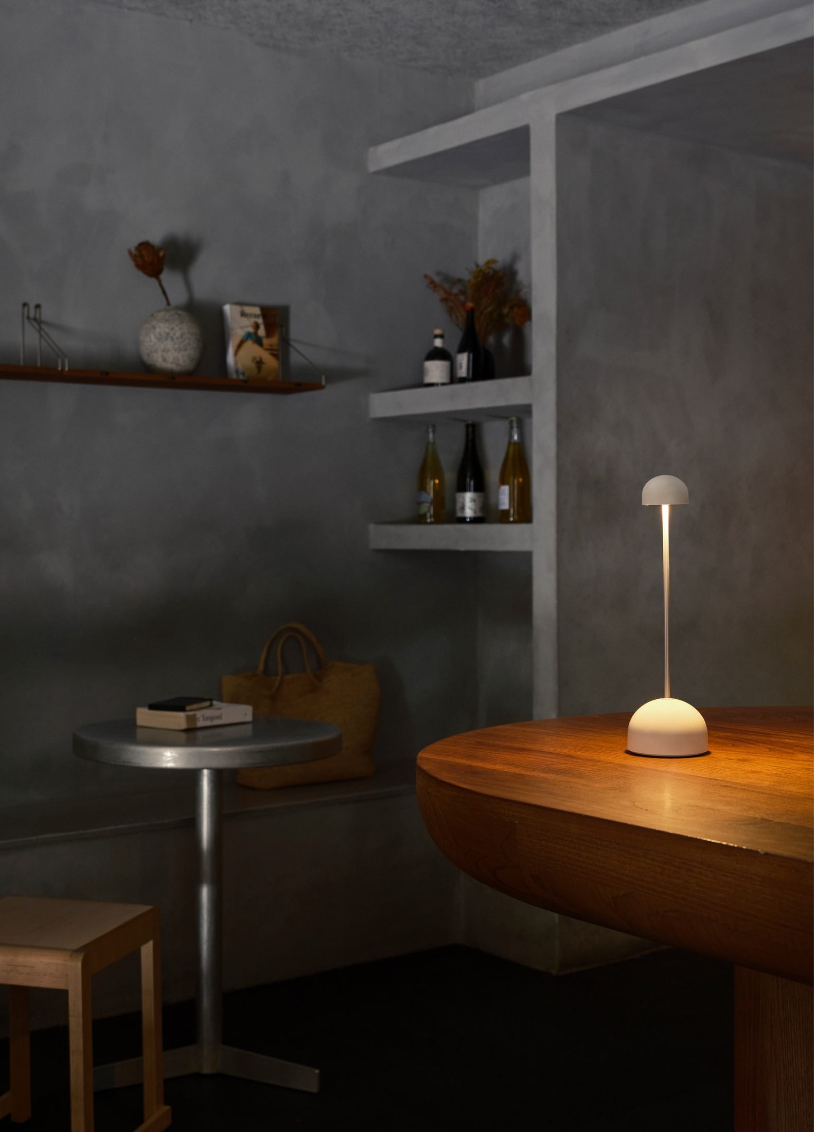
It’s sweet, like a candy, as well as practical and useful. It’s full of memories and references. I’m inspired by the Memphis era of the mid-80s, which I lived through when I was in Milan, with vivid, bright and cheerful colours. The round and seductive shapes are very present in this lamp, composed of two hemispheres separated by a thin pole. Formally, it resembles a totem, an anthropomorphic figure. I wanted it to be expressive, but without being strident, and perhaps in time it will become an “obligatory” element on a good table, just like plates, glasses, cutlery, and a good wine!
How has the journey and process personally been for you behind the creation of Sips?
I would say that the process went very smoothly and I enjoyed it a lot. It’s true that starting from a clear and precise briefing made the process much easier, if you have clear ideas from the beginning of where you want to go and have a good development team it makes everything easier.
The first thing, and bearing in mind the requirements of the briefing, was to visualise the object as I wanted it to be perceived by others, the emotions it could provoke and its usefulness to be seen immediately. From there, we provided the necessary elements for its materialisation, such as drawings, mock-ups, colour tests and quality of light. We also made sure that all the electronic parts worked correctly and complied with sustainability standards, until we reached the final prototype.
Christophe, could you talk to us about the form and adaptability behind Sips as a lamp?
Here, “form always follows function” is followed to the letter: the lampshade is small and opaque in order to take up as little space as possible and not disturb the diners. It generously illuminates the table surface and everything on it. The base is also a hemisphere large enough to contain all the electronic components and ensure their stability, but at the same time takes up the least amount of space on the table. Its shape is slim, with proportions that make it tall and slim. Its height, similar to that of a wine bottle, gives it a specific and intimate angle of light, without dazzling or invading the space.
What message or emotions would you like the public to experience when they see Sips?
I wanted it to be like coming across a beautiful object and saying: “Wow, I want it!”
From your perspective, what does Sips bring to the design world that sets it apart from other lighting solutions?
When we embarked on the project, we were already aware of the existence of lamps of this specific typology. We therefore ensured, together with Marset’s team of engineers, that the lamp was impeccably manufactured, met sustainability standards and provided the ideal light for its purpose. From there, our aim was to give it personality and a recognisable identity, allowing it to speak its own language and allowing us to be seduced by it.
Christophe, when designing Sips, what spaces did you think of it for?
It is specially designed for terraces, restaurants and cafés, and has an IP44 waterproof rating. Let’s not forget that it’s a portable lamp, so it’s ideal for both outdoor and indoor spaces.

